Have you ever wondered why so many logos seem to be blue or red. When I first started out in this business, I knew the CMYK breakdown of PMS 185 and PMS 285 by heart. (Yeah, there ‘s got to be a couple other senior creative types nodding their heads out there.)
For a long time, I thought it was because these particular colors convert better than others to CMYK. (That stands for cyan, magenta, yellow and black in the printing biz. And don’t ask me why “K” is for black. That’s another blog post.) That was back before, dare I say, the internet. Well, maybe after the internet, but before the onslaught of marketing potential that the internet eventually brought with it.
However, printing ease is not the real reason. There are other reasons for the dominant blue and red in our international logo soup. And I find them fascinating! Maybe you will too.
Apparently the world loves blue!
An article from Inc.com says that as early as the 1940s the consensus was “blue” when asking people what their favorite color is. These finding were across all demographics! Age. Race. Location. etc. The basic finding was that if you like what you associate with a color, you’ll like the color. So, for example, if you like limes, grass and leaves, you’ll most likely like the color green. The reason everyone loves blue is because there are so many positive visuals with blue… blue skies, a beautiful view of the ocean. So the plethora of blue in branding is more of a mind game, playing on your emotions and manipulating you into a “good feeling.” Hey, it works.
Red is just hard to ignore.
Plain and simple, it’s a scientific fact that red gets your attention. That’s why stop signs and fire engines are red. It’s the color that says “emergency” but also “love.” But because of its natural….noticeability…you’ll find many spontaneous-purchase establishments utilizing the color red, like fast food restaurants. In fact, studies show that people make spontaneous decisions and gut judgements within about 90 seconds of seeing something or someone, and 90 percent is based on color alone.
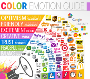
Wondering about other logo colors and your brain? Here is an interesting chart that depicts what emotions certain colors evoke. See where you fall on the spectrum and if it matches what you’re trying to convey.

And if you’re still curious, here are some other articles I found on the subject. Pretty interesting.
Inc.com — The Science behind blue logos
Brandwatch — What colors tell your customers
